Crave Mead Cinemagraph
Eye-Catching Cinemagraph Photography
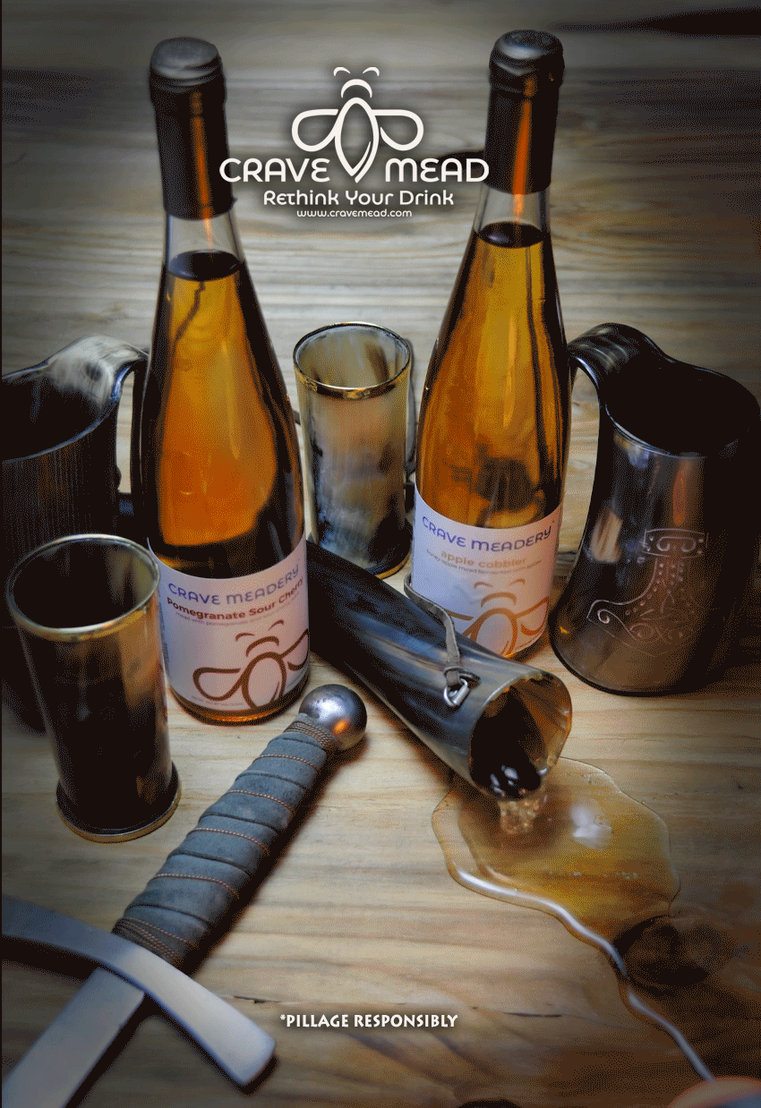
Table of Contents
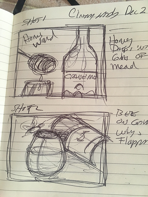
Crave Mead Cinemagraph Motion Graphic Study
CASE STUDY: CRAVE MEAD
In this study, I will show the various trials and challenges in creating attractive cinematography for this small business. I attempt to create an attractive ad that will make their business shine a bit brighter on social media with some upgraded photography and graphic manipulation.
http://www.cravemead.com
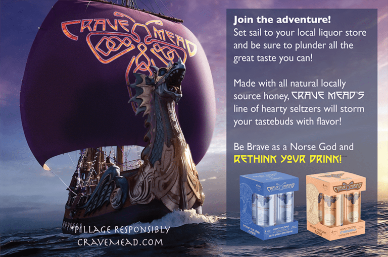
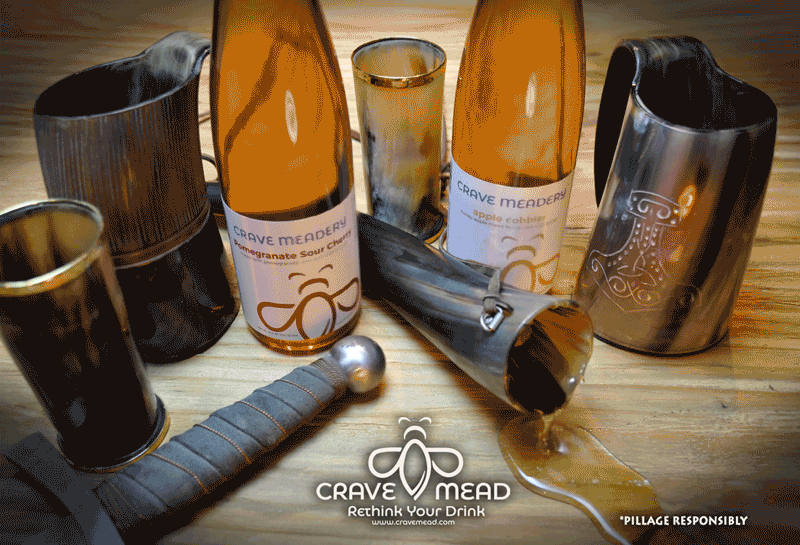
CRAVE MEAD
Crave mead is a small Meadery in Blackstone Massachusetts. It is privately owned and locally sourced. A true small family-run business.
Crave Mead, like so many small brewers, hopes to compete in a market of some big established players. They make a wonderful “honeywine” product that is easily on par with their peer. They have several wonderful staple flavors and also seasonal specialties.
https://www.cravemead.com
Their Story: “Crave Mead began in June of 2015 when a brewer of 26 years and a hobby became a beloved business. At family celebrations, we would often bring our homemade mead to the table. Family and friends enjoyed our mead so much that we decided to share it with you. Since then we have expanded, but our goals have remained the same. Create a welcoming atmosphere that makes friends feel like family and give our customers a new, unique drinking experience.
Our ingredients are locally sourced to give you seasonal flavors that are unique to the New England region. All of our meads are gluten-free and handcrafted to ensure the highest quality of mead.”
Their Challenge
Like with all small businesses, the startup budget is often eaten up by the need to “keep” the lights on. This often leaves graphics work last on the list and often done by the owner with little experience or time to focus on the advertising and overall “look” of their designs.
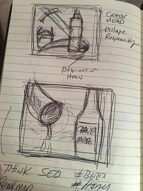
The mead industry is a small and often focused market, finding customers mostly in renaissance fairs and tastings. Their art needed upgrading and focus, but they did have some good starting points. Working from their existing slogan “Rethink Your Drink” I set about to “rethink their look”.
My Approach
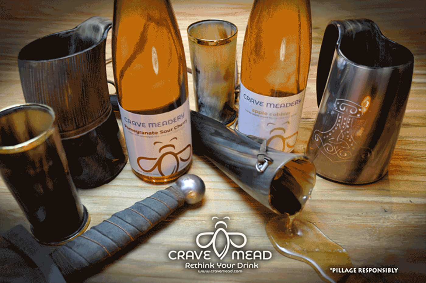
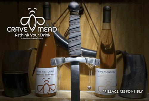
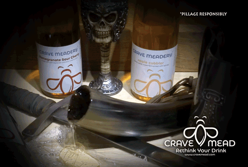
Their existing tone to their product was to avoid (it seemed) any historic or “Arthurian” subject matter. As a result, their logo and label design could be mistaken for a product other than liquor. So my challenge was to hit on a “Viking” angle to clue the audience as to what the product is in no uncertain terms. Also, use a bit of humor with the tag *Pillage Responsibly.
My personal experience dealing with any rebranding is to start strong and meet the client in the middle. In this instance, I was radically moving the look away from their tepid strategy to one a bit bold and uncharacteristic of what they had done.
Being as I was on a crunch, and I was offering my services pro bono there was not much back and forth. I was going to engage my ideas and put them up for the client to shoot down if they felt it was wrong for their company.
Results
The primary objective of this project was to give the client a more polished and exciting look. On that level I think it succeed. But a full rebranding is needed to pull the whole look of the company together and that is a much larger challenge.
Should the owners continue to use my creative work, I feel we could make a cleaner and more professional production and footprint on social media. What is done here is a small step in an overhaul I would like to see from label redesign to packaging. For now some eye catching social media posts using cinemagraphs and better imagery should go a long way.
My client will be very satisfied I am sure and I hope to help them by producing quality art for them moving forward.
The complete breakdown of the experience is in the following demonstration.