Crave Mead New Seltzers and Image Redesign!
A fun and new line of seltzers based on the legendary taste and style of ancient mead.
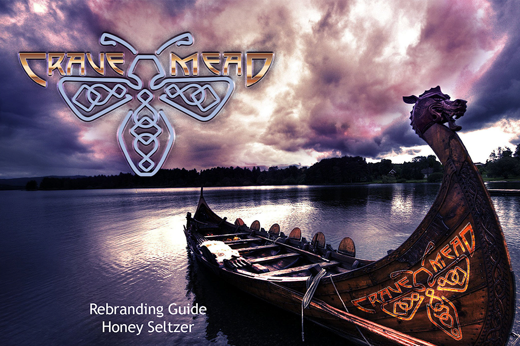
Table of Contents
Crave Mead is a local meadery that wanted a new look and was marketing a new product. Seltzers have become very popular and I was tasked with inventing a look that would expand on their original style. Since the original product sold by Crave was custom locally sourced meads, it only made sense that moving into the seltzer market was a great new opportunity. The “look” would be different than their flagship meads and offer a bolder and unique styling reminiscent of the Viking age!
this is an offshoot of Crave Meads’ traditional line of meads!
http://www.cravemead.com, https://www.ryfagraphics.com/2022/05/30/crave-mead-cinemagraph/
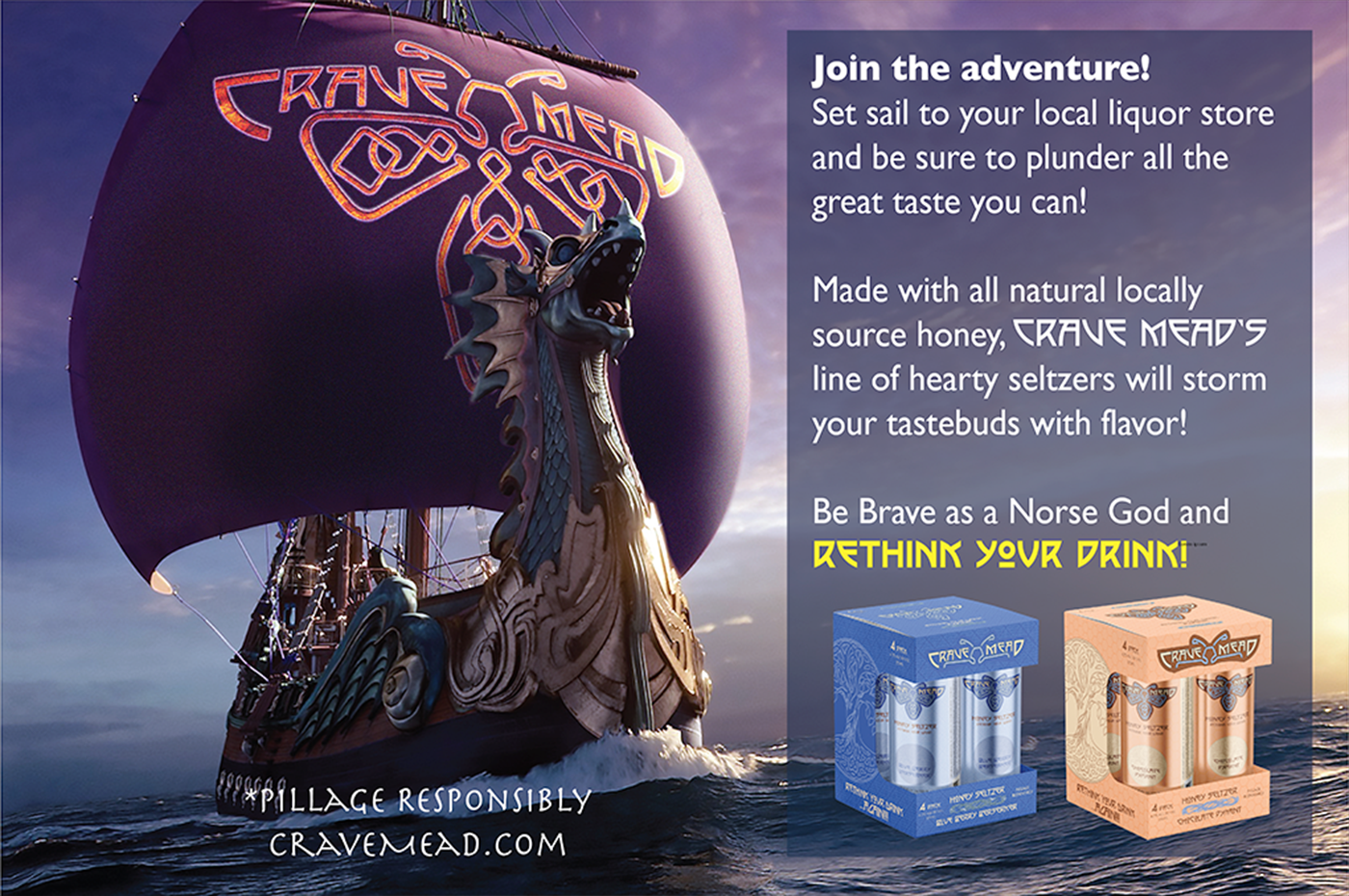
Combining the new demand for new-world drinks with old-world savvy, Crave Mead introduced a line of mead seltzers for your drinking pleasure.
https://www.heritagedaily.com/2020/03/history-of-mead/126299
Crave Mead Style Guide
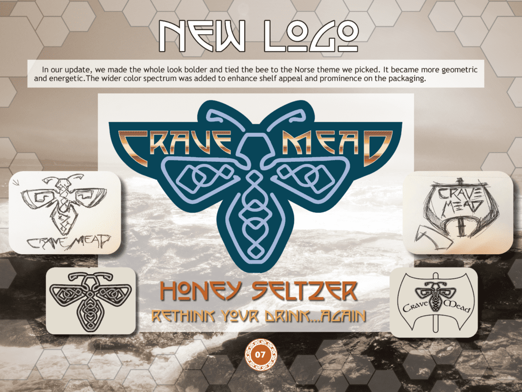
All new design adventures begin with a new logo for a fresh look that declares the direction of the project. As the customer’s original logo was a bee, I kept the idea but spun it by putting a Celtic knotwork and nordic copy in the design. This would give us a look of a rune as a centerpiece for the following designs.
Logo Revision: The previous Crave Mead logo would go through a revision to make it have more continuity with where the brand look as well as Craves look would move. The softer modern look would be maintained but adopt the geometric pattern in Celtic knot patterns. Here the feel of a Norse heritage would be introduced without losing a modern flavor.
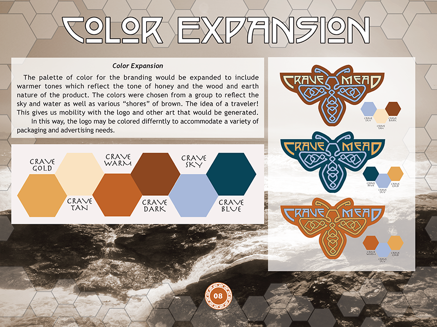
Color Expansion: The palette of color for the branding would be expanded to include warmer tones which reflect the tone of honey and the wood and earth nature of the product. This also allows the logo to be transformed to work on a variety of backdrops depending on the need. The color palette would be based on a selection of mead colors from their actual mead selection. Blueberry Pomegranate and Pyment would be the base blue and golds selected.
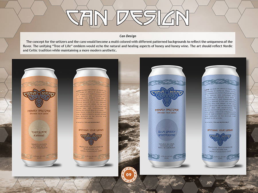
Can Design: The concept for the seltzers and the cans would become a multi-colored with different patterned backgrounds to reflect the uniqueness of the flavor. The unifying “Tree of Life” emblem would echo honey and honey wine’s natural and healing aspects. The art should reflect Nordic and Celtic traditions while maintaining a modern aesthetic.
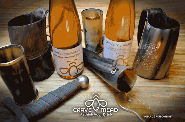
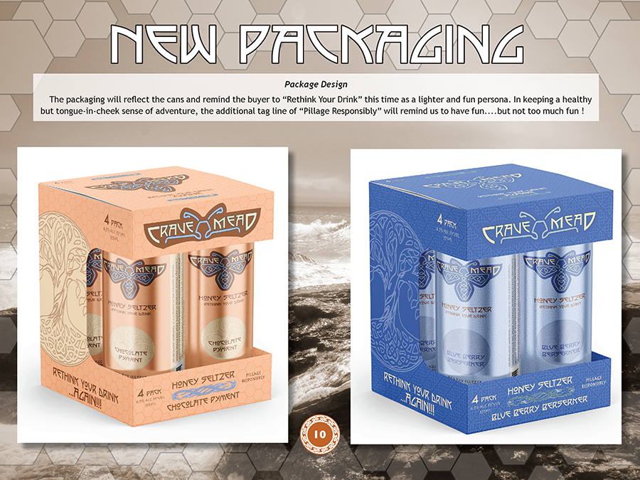
Package Design: The packaging will reflect the cans and remind the buyer to “Rethink Your Drink” this time with a lighter and fun persona. In keeping a healthy but tongue-in-cheek sense of adventure, the additional tagline of “Pillage Responsibly” will remind us to have fun….but not too much fun!
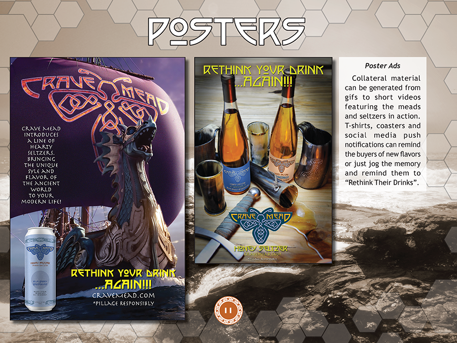
Poster Ads: Collateral material can be generated from gifs to short videos featuring the meads and seltzers in action. T-shirts, coasters and social media push notifications can remind the buyers of new flavors or just jog their memory and remind them to “Rethink Their Drinks”.
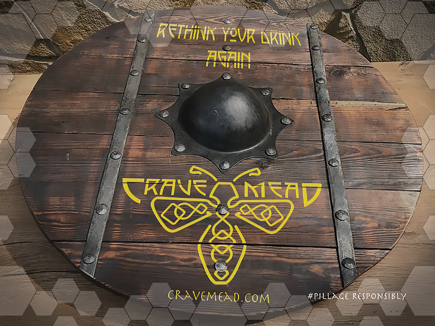
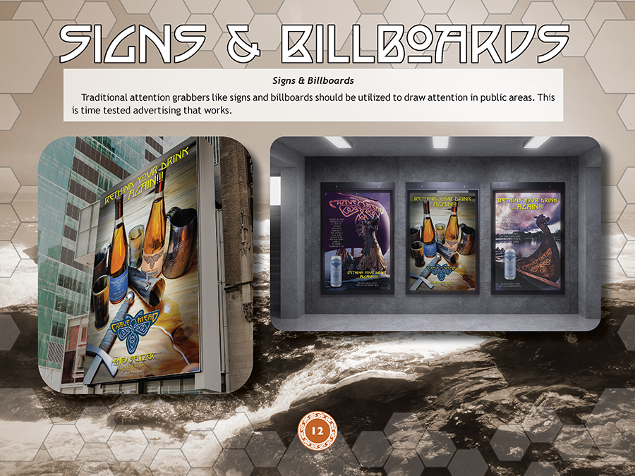
Signs & Billboards: Traditional attention grabbers like signs and billboards should be utilized to draw attention in public areas. This is time-tested advertising that works.
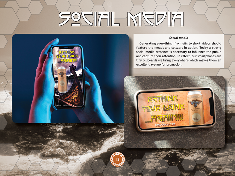
Social media: Generating everything from gifs to short videos should feature the meads and seltzers in action. Today a strong social media presence is necessary to influence the public and capture their attention. In effect, our smartphones are tiny billboards we bring everywhere which makes them an excellent avenue for promotion.
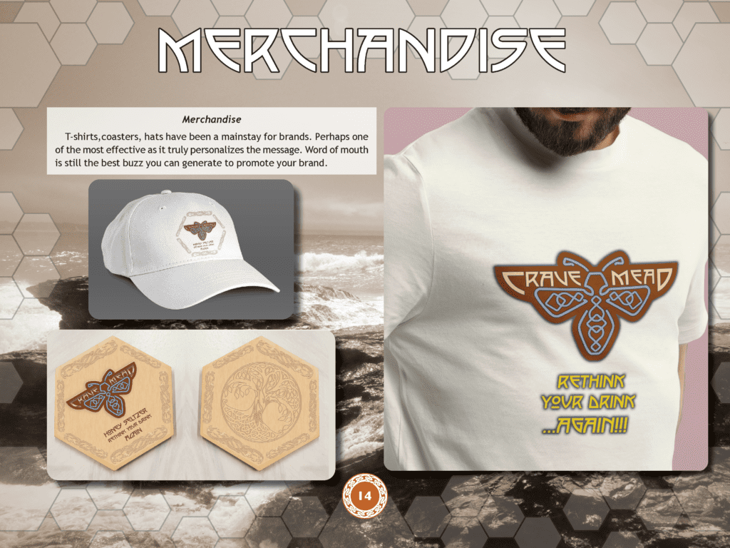
Merchandise: T-shirts, coasters, and hats have been a mainstay for brands. Perhaps one of the most effective as it truly personalizes the message. Word of mouth is still the best buzz you can generate to promote your brand.